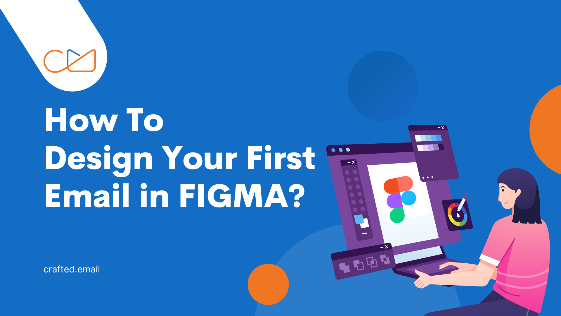
An Introduction to FIGMA
Designing your first-ever email is always an exciting process. Add FIGMA into this mix and you are sure to kickstart your campaign on the right foot!
Why?
FIGMA is one of the most desired and popular tools taking the UI/UX design world by storm these days. This powerful design tool helps you create anything — emails, websites, applications, logos, and much more. By learning to use FIGMA, you’ll take your first steps into User Interface Design and User Experience Design. Before you learn how to design your first email in FIGMA community, let’s take you through a few elements.
What Makes an Email Design Good?
Before getting into designing your first FIGMA HTML email template, here’s an easy way to get responsive HTML email code in just a few seconds!
- Keep it simple and focused: It helps create a responsive HTML template that works in every email client and all mobile and tablet apps.
- Ensure it’s captivating: Have a mix of illustrations, colors, and a striking featured image.
- Be creative: Your email template should stand out from the rest of the countless others flooding your receiver’s inbox.
- Consistency is key: With a consistent layout, website developers only require a small number of reusable templates for your pages.
- Give your content room to breathe: It beautifies the user experience so users can emphasize focus points.
Here are a few tips for creating responsive email templates in HTML along with a free email template that leaves a sure-shot impact too.
Let’s move on to how we can create a good email design!
Structure/Layout
When checking out how to design your first email in FIGMA for beginners, structure/layout is an element you shouldn’t ignore. The email layout helps you get an idea of how you are going to place your images, texts, and videos in the email. The way you structure your layout determines how visually engaging and appealing it is going to look.
Width size
Here are some tips on the best widths and sizes to use for your FIGMA email format and designs.
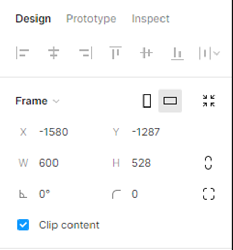
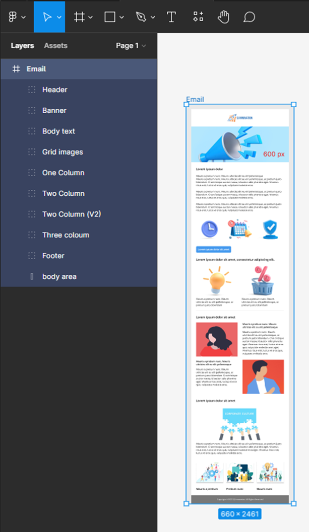
- Take a blank layer and rename it.
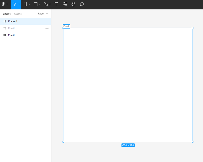
- The standard width of an email is 600 px.
- However, any email size can be used such as 700 or 800px.
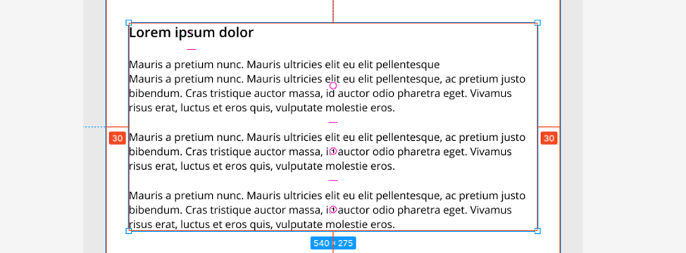
- For our design, the width is 600 px, so all content should be in 540 widths.
There are many advantages to using a 600px email design such as:
1. Users can give a clear display of the content, images, and other user interfaces of the email clearly without scattering its pixels.
2. Most email templates are set at 600 px as their standard sizes to draft mail for the client.
3. Its dimensions suit all of the all-screen size devices and the user gets a clear view of the email in a better way.
- Height can be adjustable according to design on a free FIGMA email template.
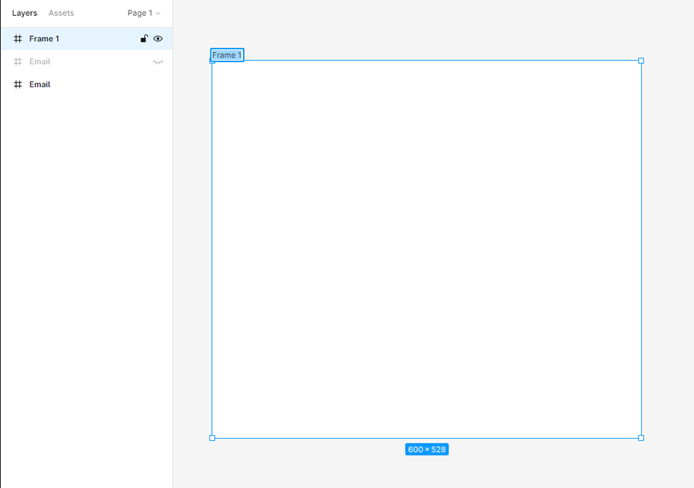
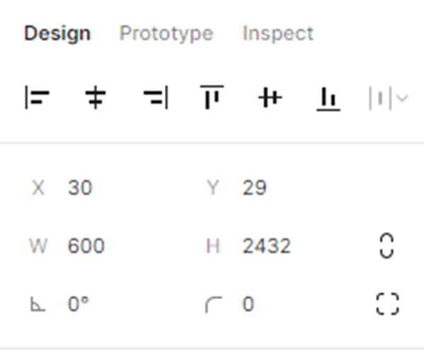
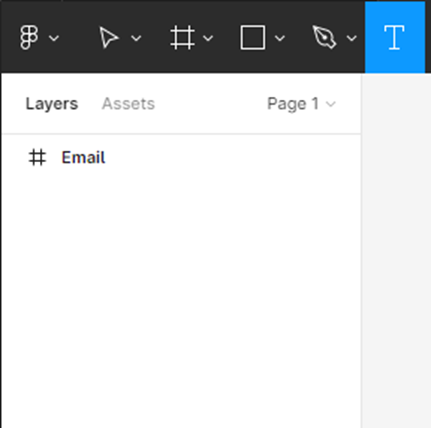
First, we have to take a frame and set the width to 600px, and rename it as “Email”.

To rename, you have to double-click on the frame text and rename it.
Branding/Color
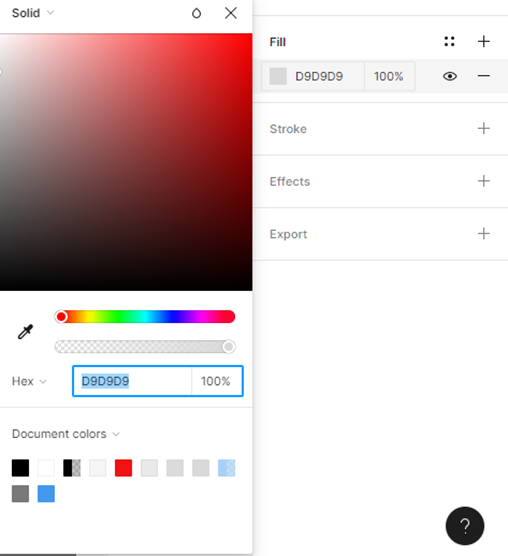
When learning how to design your first email in FIGMA for free and also for email design in general, we should choose colors wisely. Preferably, do not choose vibrant colors but always focus on using brand colors.

For selecting colors for your design, you will see on the right panel that there is a fill section. You have to select that and choose your required colors from there.
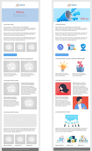
Header & Banner
- We can put a logo or images that represent the branding process.
- Put it in the center or left/right and align it according to your needs.
- The banner width should be 600 px.

Gutter space: 20/30/40 px
- We can maintain 30 px gutter space on either side of the container (standard).
- All of the content should be in a container of 540 width.
- To check the gutter space, select the content and press Alt.
Typography:
- Requires you to be consistent with fonts.
- For a FIGMA Gmail template, Web safe fonts such as Open sans, Poppins, Roboto, Tahoma, and Verdana fonts would be a good choice.
- Heading text should be different from body text.
- Heading text should be 18 and body text should be 14 (standard).

For text, you should select the text tool, drag a text box and type your text. From the right panel, the text section you can change the text style, font size and line spacing, alignment, etc.


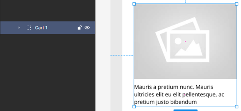
Images in email
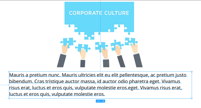
- Putting some images to make your email design look good is a wonderful idea.
- Make sure the image sizes are the same.
- Spacing between images should be consistent.
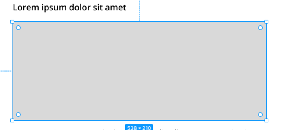
For putting an image in an email design, first, you have to take a rectangle (image size depends on design).

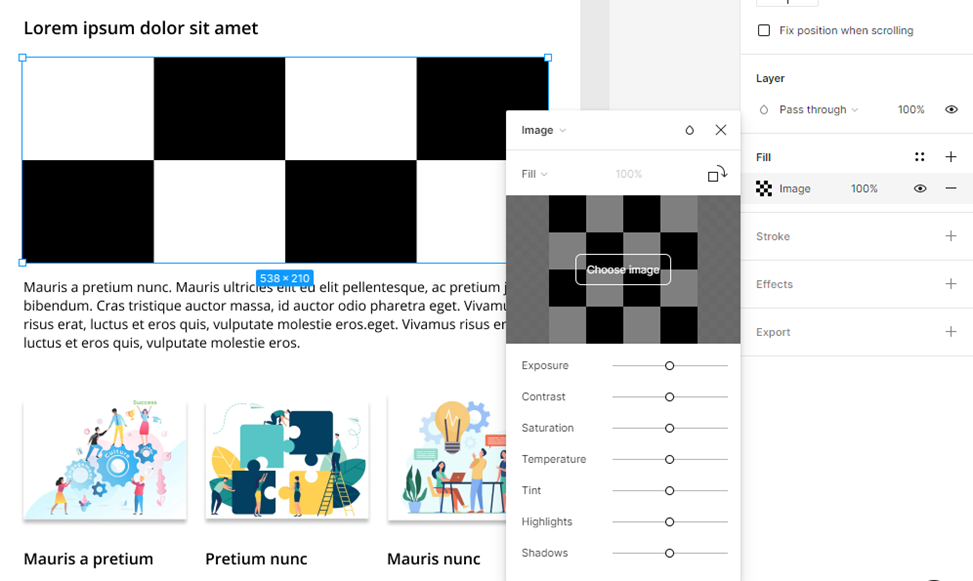
Then, from the right panel, you have to select fill and then choose the “Image” option. After that, you have to put your image there.


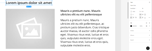
One/two/three column layout:
One Column Layout:
- There will be one column content (one image and below that put some texts).
- We need to keep 30 px gutter space on both sides.
- So, all content should be in a container of 540 width.

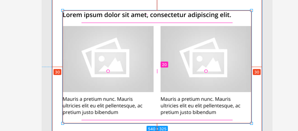
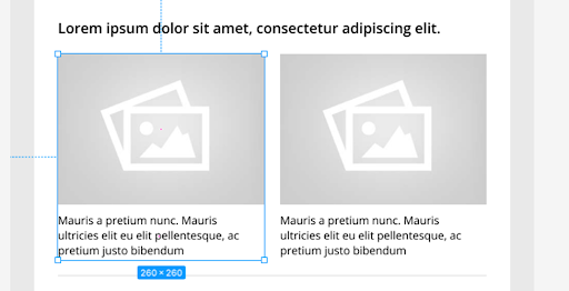
Two Column Layout:
- There will be two column content.
- We need to keep 30 px gutter space on both sides.
- So, all content should be in a container of 540 width but there will be two columns, we need to keep 20 px spacing between two columns.
- The column width would be 260 px, height depends on design.
- We can also present a two column layout in another variation.

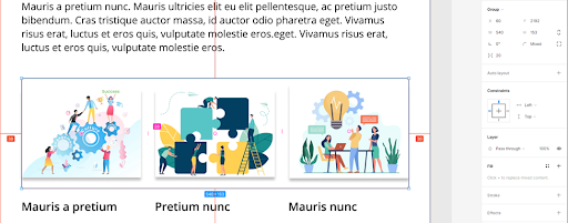
Three Column Layout:
- There will also be three column content.
- We need to keep the same spacing between the three columns.

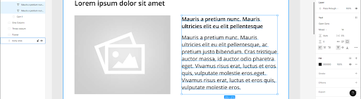
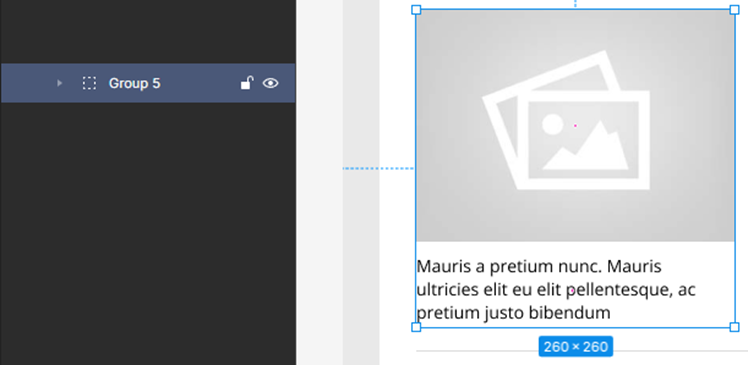
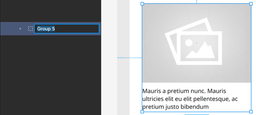
Group the Section/ Layout:
For any kind of layout, we need to group each section. This makes our work easy and organized. For grouping the section, you have to press and hold the shift button and select your image layer and text layer. After that press CTRL + G. Then, rename that section and to do that, you have to double click on that group layer and then rename it.

CTA
Height should be a minimum of 40 px.
We use this height as this is user-friendly for mobile UI.

Footer:
- Put a logo if required.
- There should be copyright.
- You can put social media icons/links.
- There should be an unsubscribe link.


You should group your entire email design section and rename it section-wise. That will make your work easy and your email design will look organized.
FULL EMAIL DESIGN IMAGE
Designing your first email can be a challenging task, but with the right tools and expertise, you can learn how to design your first email in FIGMA using javascript easily. Our custom email developer agency can teach you how to design your first email in FIGMA using javascript or HTML, and provide you with the tools and knowledge to create email campaigns that resonate with your audience. Contact us today to learn more and start creating emails that drive results!